


![]()
Have you been in a place where your manager has scolded you for poor report presentation? Then you are in the right place because this tutorial is all about creating a better report on Power BI Report.
You may have a lot of questions like what it takes to design a good Power BI report. Is it easy to use? This blog will help you create a basic report for the data imported from Excel.
The blog will cover the following topic:
- Power BI Report
- Add a Title
- Column Chart
- Line Graph
- Funnel Chart
- Gauge, Slicer, Map, and Pie Chart
- Changing Report Theme
It is essential to make the foundation strong, to build the beautiful structure, so let’s dive into it!
Power BI Report – Overview
Power BI report is the tool that helps in visualising the data from multi-perspective view to extract insightful information
Here is the Power BI Report View 👇

The Power BI Report consists of the following components:
1.Report View – It is a small icon on the left navigation pane, where one can create numerous report. Visualisations from one page to another can be easily copied, merged, and pasted.
2. The Ribbon – Different features and activities available for editing and making a report more attractive and interactive.
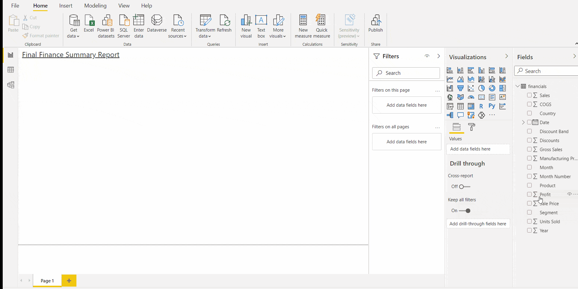
3. Report Canvas – The white space you see when you click on the report view is the report canvas. It is the design surface where one draw and customises the visualizations and reports. It also includes report pages named Page 1, Page 2; you can add as many you want.
4. Visualizations – Different type of visualizations provided by the Power BI are shown in the image below.
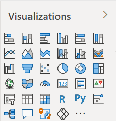
You can select any visualisation from the pane and edit, customise and modify it according to your need. Column chart, line graph, area chart, pie chart, doughnut, clustered chart, map, gauge, slicer, scattered and so on are the different options available.
Each visualization feature consists of three options:
 Fields – It specifies the fields or datasets to be used for the particular selected visualisation.
 Format – The selected visualisation can be customised and configured to make a better presentation.
 Analytics – It is used for adding the reference to visualisation. Analytics is not available for each visualisation.
5. Fields – It contains various segments like folders and table of the datasets. From the fields pane, we select the areas we want to create visuals.
6. Filters – Power BI helps to view, modify and set the filters for the report page, visuals and drill through the data.
Check Out: What is Power bi and how does it work? Click here
Prerequisites
- We will work on Power BI Desktop, Download Power BI Desktop before starting.
- Import and transform data. You can refer to the following blog How to Transform Data in Power BI – Clean and Load Data in Power Query.
With the proper data, you are good to go for building your first report.
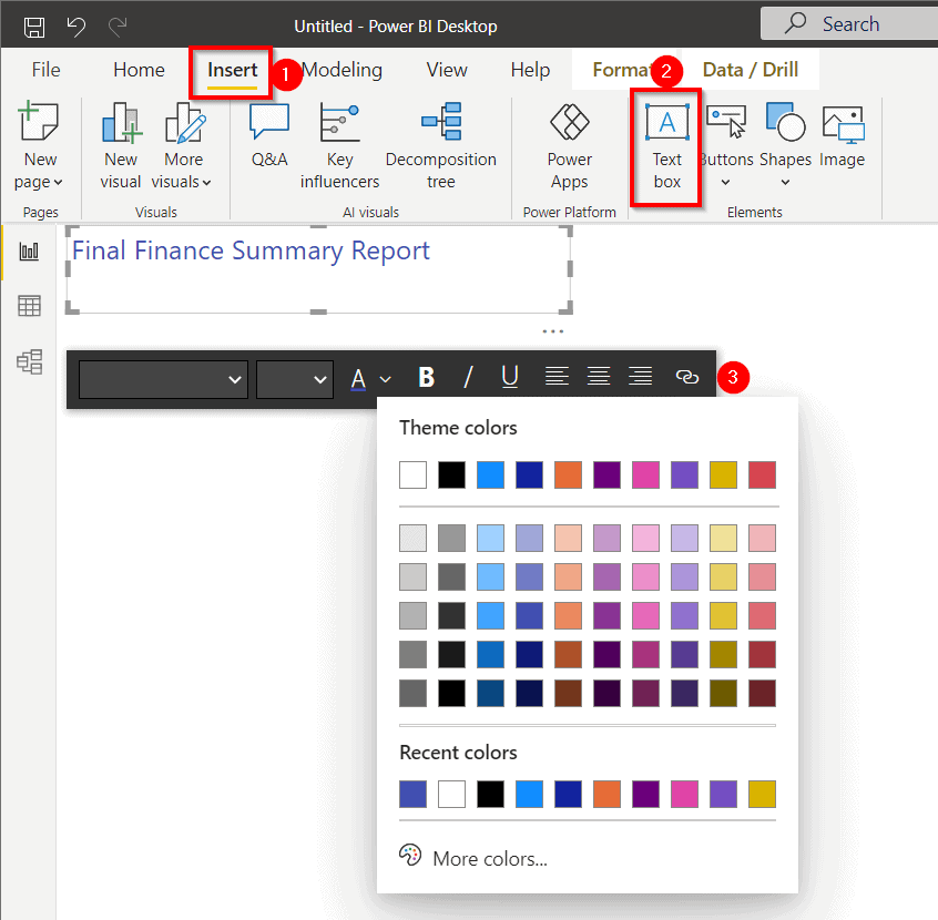
Power BI Report Title
The title is the heading given to the Power BI report. To add a title:
- Click on the “Insert” option from the ribbon,
- Select “Text box“.
- A text box will appear, give a suitable heading to your report, and provide you with the customisation options.
Check Out: Our previous blog post on Microsoft Certified Data Analyst. Click here
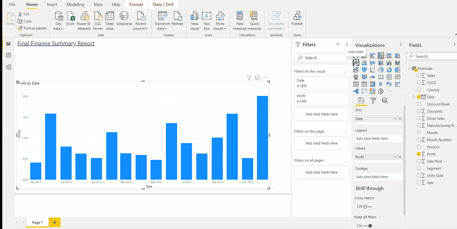
Column Chart
Lets’s first create a column chart for our report.
- Drag the two fields from the fields pane into the report canvas. Here we have selected Profit and Date.
- If you feel your visualisation is small in size, you can simply select the visual and drag its corner to enlarge it.
- By default, a column chart is displayed by the Power BI. It shows the profit result of the two years.
- In the Visualization pane, under the field segment, drop down the Axis menu. Select Date.
- Now, profit results for each month are displayed in the column chart.
Also Check: Microsoft Power bi vs Tableau, to know the major differences between them.
Line Graph
We feel that the column chart is not providing great results and wishes to change it to a line graph. So how you do it? Follow here.
- Select the column chart you want to change.
- Select the Line Graph from the Visualization pane.
- If you wish, you can add another field too. Just drag the field from the Fields pane. Here we have added Sales into the line graph.
- Hover over the line graph to gain more insight into each month’s Profit and Sales data.
Read More: About Data Analysis Expressions. Click here
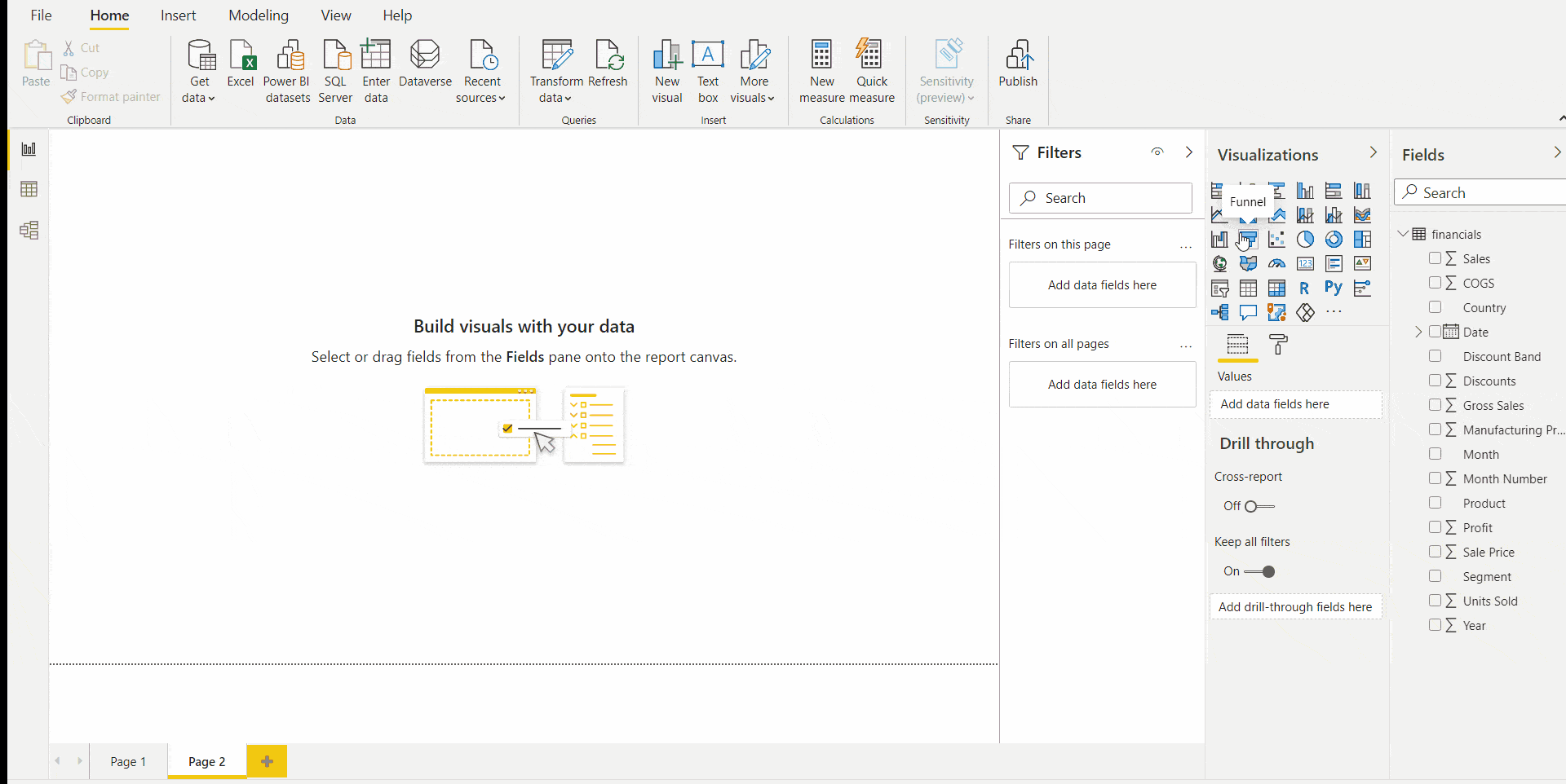
Funnel Chart
Now let’s create a funnel chart
- Select the funnel chart from the visualisation pane. Resize the chart.
- Select the funnel chart at the report canvas.
- Drag the fields from the Fields pane to the funnel visualisation.
- You can customise the funnel chart, change its colour, text size, text colour, background colour by going to the Format option in the Visualization pane.
Check Out: Our blog post on Microsoft Azure Power Bi. Click here
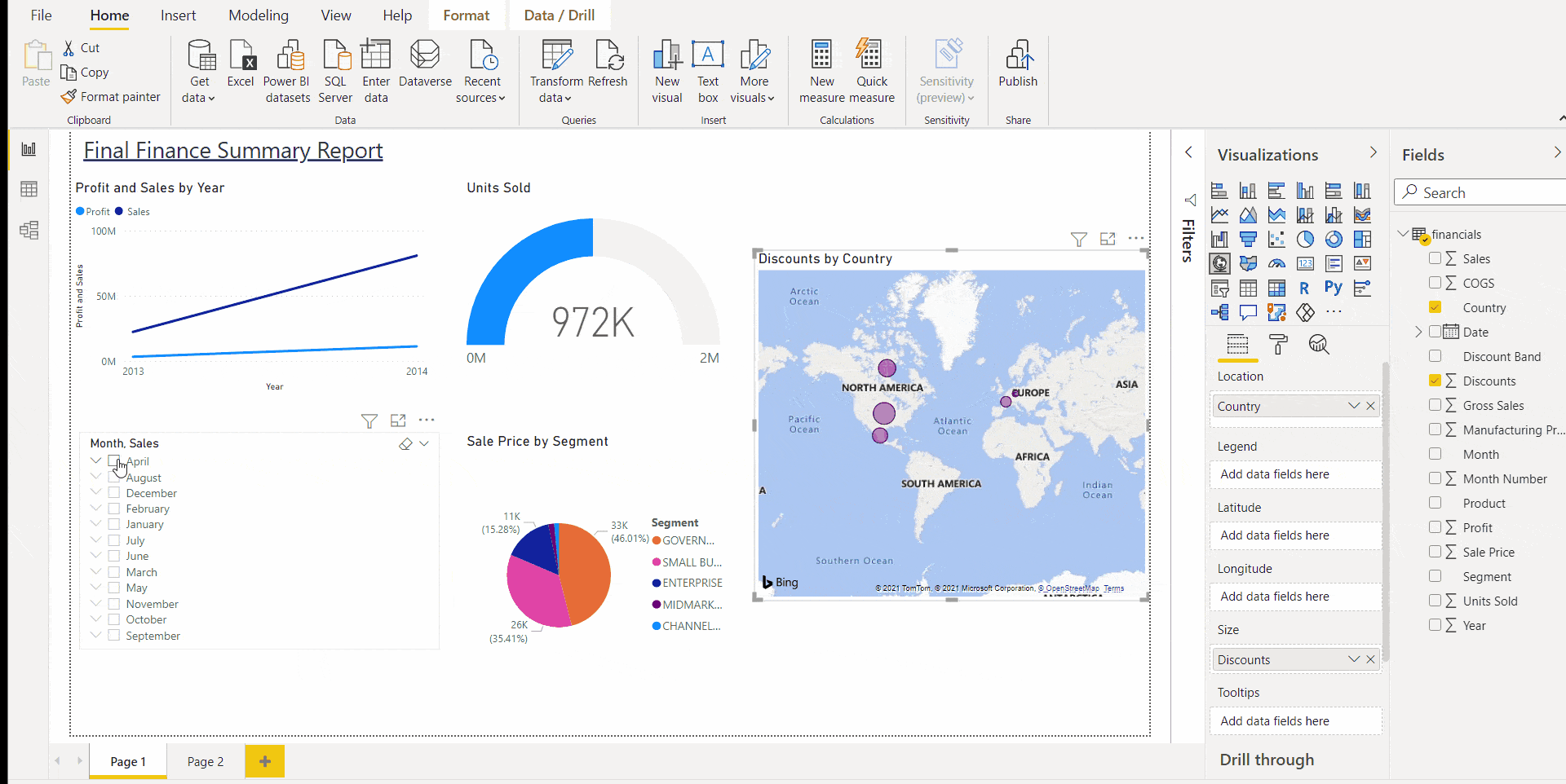
Gauge, Pie Chart, Slicer and Map
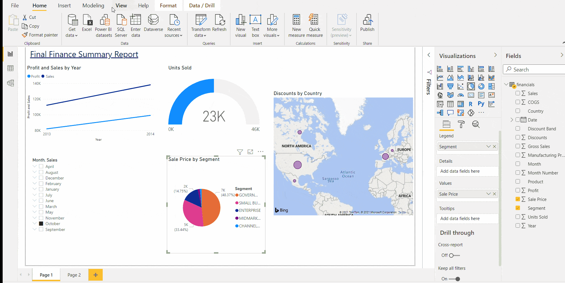
Power BI report allows you to create Gauge, Pie chart, Slicer, and Map in the report. You just have to drag the visualisation from the Visualisation and fields from the field pane. And there you go, with all the charts in front of your screen.
Power BI provides insight into data when particular visualisation is hovered or clicked. Refer to the image below: When we click on April on the slicer chart, data in the other graph shows details concerning April. Similarly, you can check for others too.
Wonderful isn’t it ??
Check Out: What is Power Query? Click here
Changing Theme
Power BI report even allows you to change the theme to make it more creative and attractive. To change the theme:
- Go to the “View” option in the Ribbon bar.
- A theme chart will appear; select any theme you want by just clicking on it.
- You can customise the selected theme by clicking on “Customize current theme“.
- It lets you customise the Name and colours, Text, Visuals, Page and Filter page.
- After you set your desire customisation, Click on “Apply“.
If you have completed your report, don’t forget to save it with a suitable name.
Also Read: Our blog post on PL-300 Microsoft. Click here
Conclusion
Power BI report is a powerful tool for building and presenting data in visuals and reports. It has a lot more to offer in addition to what we have seen. You can apply the same concept for most of the visualisation that has been displayed in this blog.
The best way to learn to build a report is to try your hands on it. From the blog, it is clear that making a report is very easy in Power BI, so experiment with different visualisations and explore its features. Hence it can fairly be said that Power BI reports are solid options to build effective report. Build your report with Power BI and impress your bosses. Keep Reading.
References
- Introduction to Microsoft Power BI Platform | Everything You Must Know
- Exam PL-300: Microsoft Power BI Data Analyst | A Replacement Of DA-100
- Microsoft Certified Data Analyst Associate [PL-300] Step By Step Activity Guides (Hands-On Labs)
- Case Study: Display Live Data Streaming Using Power BI Service
- Introduction to Data Modeling in Power BI
- What is Power Query | Microsoft Azure Power BI Tool
Next Steps to begin with PL-300 Certification:
In our PL-300 Certification Training Program, we’ll cover 10+ Hands-On Labs. If you wish to start your journey towards becoming a Microsoft Certified: Power BI Data Analyst Associate, try our FREE CLASS.

![Microsoft Agentic AI Business Solutions Architect [AB-100] | K21 Academy](https://test.k21academy.com/wp-content/uploads/2025/11/Microsoft-Agentic-AI-Business-Solutions-Architect-AB-100-Exam-Overview1.png)